The Gridd theme has an innovative approach to site-building, allowing you to build any kind of layout with ease using our unique grid control.
Inside the “Grid” section in the WordPress Customizer you will find the following settings:
Grid Settings
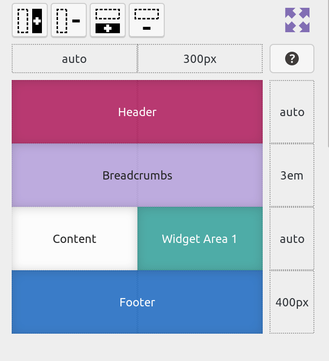
Building a layout has never been this easy!
Separate your page in columns and rows, place the header, footer, sidebars and a number of other grid-parts wherever you want, define custom widths for your columns and height for your rows.
For more information on how the grid control works, you can read this article in our documentation.
Mobile Breakpoint
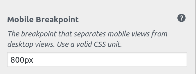
The breakpoint is what separates a mobile device from a desktop device.
Users on small devices (below the breakpoint) will get a stacked view, while users on larger devices (above the breakpoint) will get the grid view.
Gridd Plus Mobile Grid
To customize mobile grids, Gridd Plus is required.
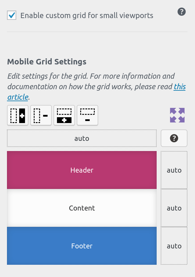
In Grid Plus you have the option to define a custom grid for mobile devices.
Switch the “Grid Small Viewports Mode” control to custom, and a new control for your mobile grid will appear.
You can add grid-parts that you you want show only on small devices, remove parts that are not necessary for a mobile experience, reorder the grid-parts, and even edit the sizes for your rows and columns independently from the desktop grid.
Our advise it to always check your site on a mobile device and provide a simplified experience to your mobile users.
Grid Container Gap
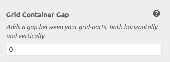
If you want your grid-parts to have some spacing between then you can define a CSS value in this field.
Your background color and background image will be visible from these gaps, allowing you to create a cards-like design.
Grid Container Max-Width
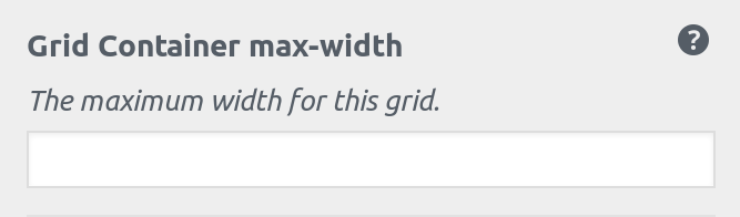
If you want to create a boxed layout you can use this control to define the maximum width for your grid.
Background Color
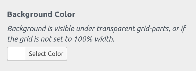
Define a background color for the whole page.
If your layout is boxed then this color will be visible on the sides.
The color selected here will also be visible if you have used a grid-gap.
Background Image
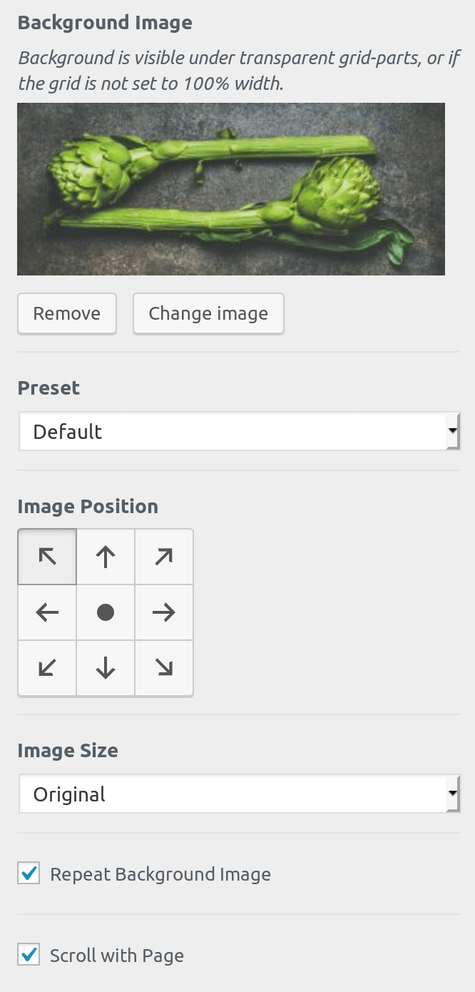
Similarly to the background color, if you define a background image it will be visible on the sides of a boxed layout, between grid-gaps and also underneath grid-parts that have a transparent background.
Grid Parts Load Order
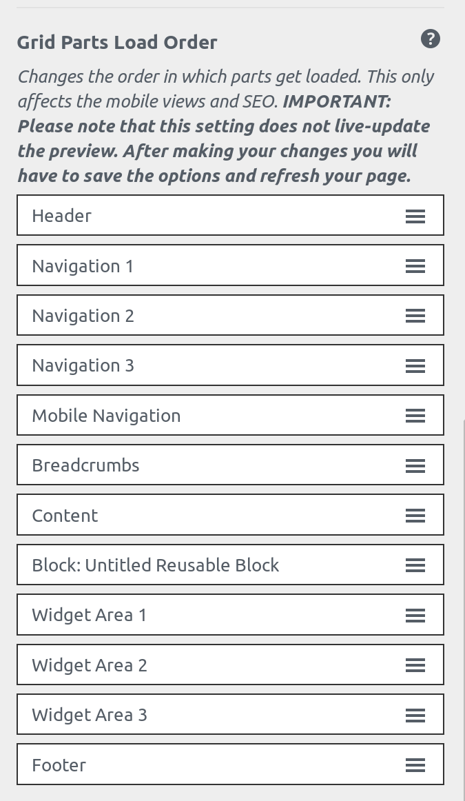
You can customize the order in which your grid-parts are loaded. This will change the way your HTML is structured which has an impact both on accessibility and SEO.
Make sure that your content is near the top after significant navigation items.
The order defined in this field will also change the visual order in small devices.
Gridd Plus users have the ability to change the visual order in mobile devices independently of the load order using the separate mobile-grid setting.
Please note that this setting does not live-update your preview pane in the customizer. Ir order to see the changes in the mobile & tablet views in the customizer you will need to save your settings and refresh the page.