You can use any valid CSS unit you want for your columns and rows. CSS-Grids however introduce another very useful concept: the fr unit. The new fr unit represents a fraction of the available space in the grid container. To make this easier to understand, let’s assume that the width of our screen is a nice round number: 1000 pixels. If we have a grid with 4 columns and each one is set to 1fr, then our browser will internally go through these steps:
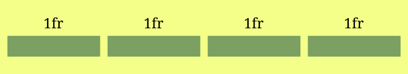
- How much space is available? 1000px.
- How many fractions exist in total? – 4 (we have 4 columns, each one being
1fr:1fr + 1fr + 1fr + 1fr). - The width of each fraction is 1000px (our total width) divided by 4 (our total number of fraction). = 250px
In the above simple example we’ll end up with 4 columns, all of them equal to 250px.
If we change the 1st column to be 2fr and leave other columns to 1fr, then the same calculations will now look like this:
- How much space is available? 1000px.
- How many fractions exist in total? 5 (we have 4 columns, the first one being
2frand others1fr:2fr + 1fr + 1fr + 1fr). - The width of each fraction is 1000px divided by 5 (our total number of fractions) = 200px.
Since each fraction is equal to 200px, our first column will have a width of 400px (2fr) and the other 3 columns will be 200px each.
Let’s make this even more complicated to cover all scenarios: We’ll have 3 columns. We’ll set the first column to 400px, the second column 2fr and the third column 1fr.
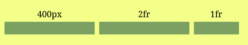
Now something interesting happens in our grid: we want one column to have a set size of 400px, and we want the other 2 columns to be auto-calculated. The fixed size of the 1st column changes the “available space” that our browser can use for its calculations so they will now look like this:
- How much space is available? 600px (the total width which is 1000px, minus all non-fr columns, so 1000px - 400px.
- How many fractions exist in total? 3 (we only take into account fr units, so we have 2fr + 1fr.
- The width of each fraction will be the available space (600px) divided by the number of total fractions (3). So each fraction will be 200px.
So now our grid-columns will have a size of 400px the 1st one, 400px the 2nd one and 200px the 3rd one. What makes this interesting is responsive layouts: We can have a sidebar for example that is set to a static value, and the rest of our layout can adjust and resize automatically depending on the user’s screen-size.