Breadcrumbs
Use the “Breadcrumbs” grid-part to add breadcrumbs on your website. Breadcrumbs will help your visitors navigate your site easier and more efficiently by showing where they are at all times.
Please note that breadcrumbs are hidden on your frontpage and their structure depends on the permalinks structure you’re using on your site.
Padding
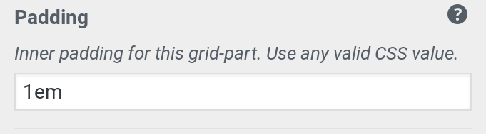
You can use the “Padding” control to change how much whitespace is available around the breadcrumbs. You can use any valid CSS usint here.
Max-Width
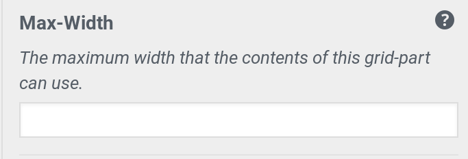
If you want your breadcrumbs to align with the content or any other grid-part that has a limited width you can enter a CSS value in this setting to match your other grid-parts. If left empty breadcrumbs will be able to use the full width available to them.
Font-Size
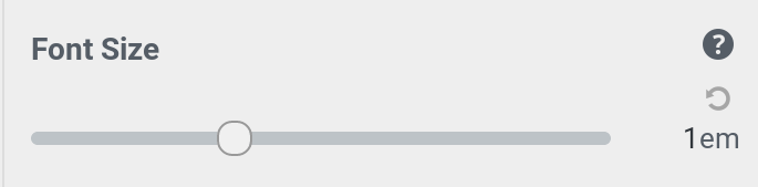
You can adjust the font-size of your breadcrumbs using the slider in this control. The selected size is relative to the size defined as your main body font-size. So if your main content uses a font-size of 16px, setting this value to 1 will make your breadcrumbs have the exact same size. If your body font-size is set to 20px and your breadcrumbs are 0.5em, then your breadcrumbs will have a size of 10px.
Background Color & Text Color
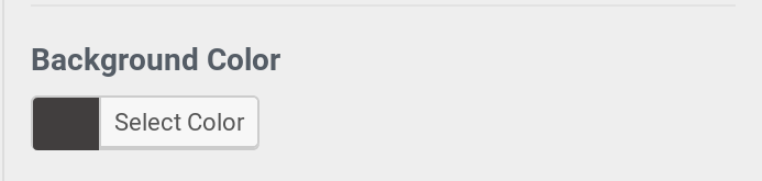
You can select a background colot for this grid part. Your text color will be autocalculated to ensure maximum readability and contrast. If you are using Gridd Plus then you will also be able to select a text color separately, choosing from an array of accessible colors or simply choosing a custom text color.
Alignment
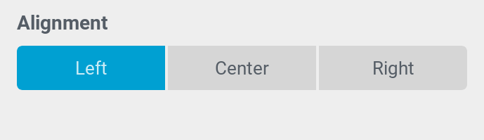
Depending on your layout you may want your breadcrumbs aligned to the left, right or center. You can use this control to select the alignment of your breadcrumbs.
Please note that choosing “right” does not reverse the order of your breadcrumbs making them go from right to left, it simply changes how the elements are horizontally aligned inside their container.