Header
The Header of the Gridd theme is unlike any other header. You can place it anywhere you want, and using its own grid control you can build it however you like. It can be as minimal or complex as you want and you can even use it on the left or right of your layout simply by changing its position in your main grid setting.
Dedicated Header Grid
Your header contains a dedicated grid you can use to build your own unique layouts.
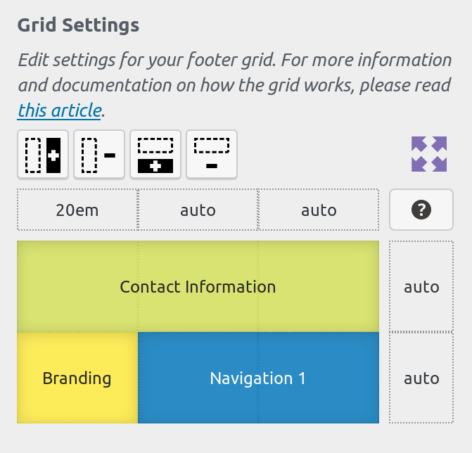
You can see separate documentation on how the grid control works in this article.
Though the header includes a grid control just like your main grid, it contains a collection of grid parts that are globally available, and some other grid-parts that have been tailor-made for use in the header. For documentation on a specific grid-part, please visit its own documentation article.
Header Mobile Grid
To customize the header mobile grid, Gridd Plus is required.
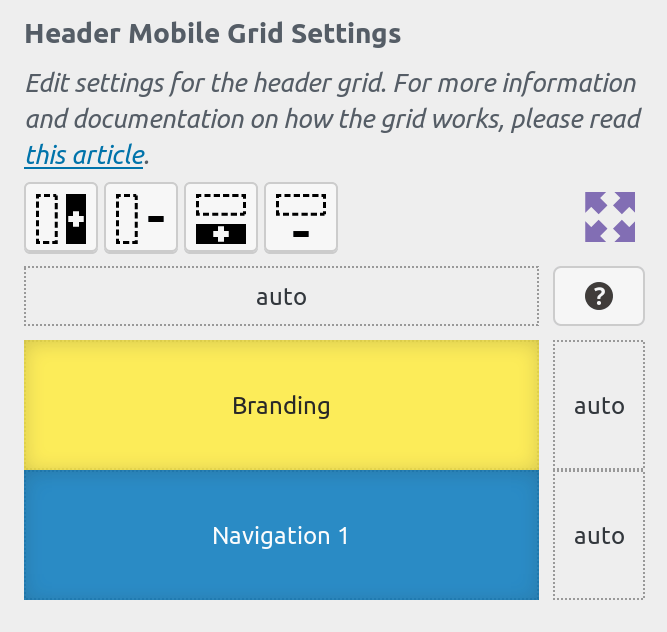
Gridd Plus users can edit the settings for mobile grids separately.
Remove grid-parts that may clutter the mobile experience or create a completely different layout and optimize your site’s mobile presence.
Maximum Width
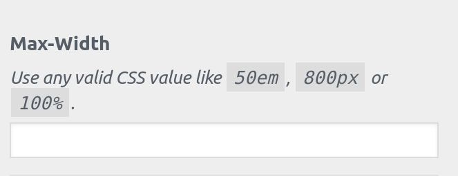
The Max-Width control allows you to define a maximum width for your header grid.
If you’re building a “boxed” layout you can use this option to define the width of your header’s container.
Grid Gap
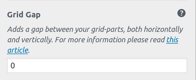
If you want to add some spacing between your header grid-parts, you can use this setting by typing a valid CSS value.
If you have defined a global background color for your header, it will be visible through these gaps providing some more visual separation.
Drop Shadow Intensity
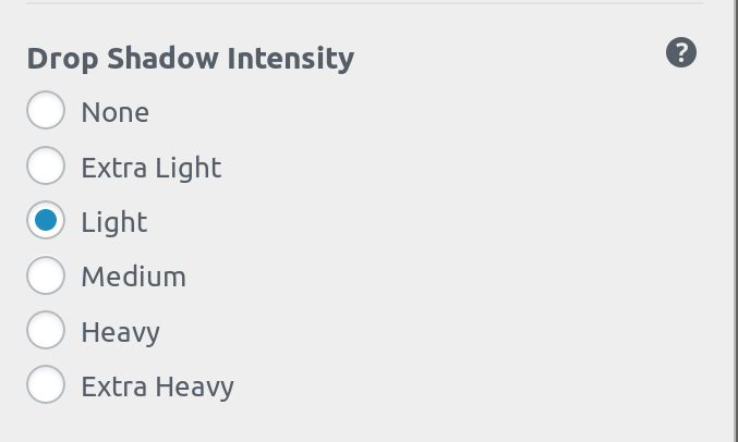
Make your header stand out by adding a shadow to it.
You can select the intensity of the shadow, or simply set to “None” to disable the shadow.
Sticky Header
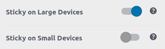
If you want your header to stick to the top of the page, you can enable that feature using these settings
We use a CSS-only implementation for sticky headers so your site doesn’t load any unnecessary scripts.
Please note that the “Sticky on Small Devices” option is only accessible if sticky header is enabled for large devices.
We recommend you only enable the sticky option if your header is thin. Enabling sticky headers on mobile should be avoided since real-estate is at a premium in small screens.
Background Color
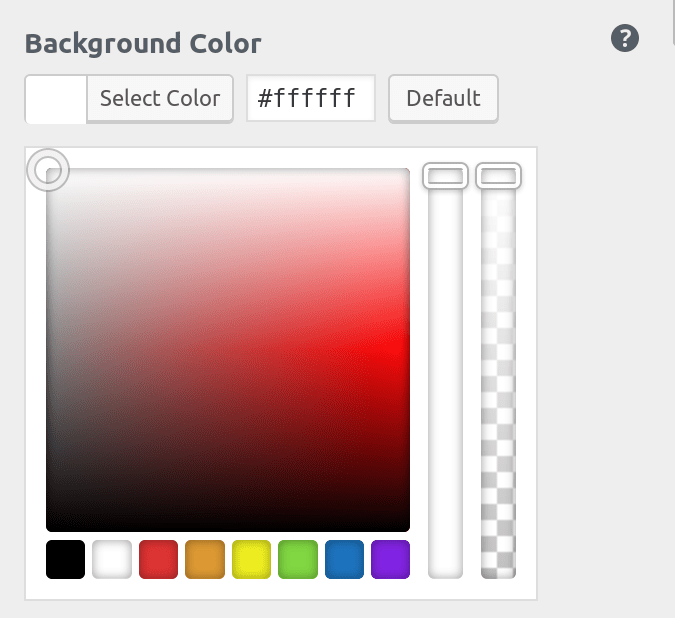
Use this setting to add a global background color to your header.
Individual grid-parts inside your header all have their own separate and independent background color setting. However, if they use a semi-transparent or completely transparent background color then the global header background will be visible underneath them.
Background Image
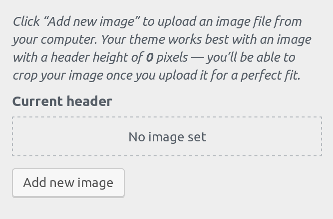
Upload multiple images to be used as background images using the background-image control.
If a .png image is used with a transparency, then the selected background-color will be visible underneath the transparent parts of the image.