Navigation
The “Navigation” grid-part in the Gridd theme allows you to add multiple navigation areas and style them each one independently.
Each navigation contains the following options:
Responsive Behavior
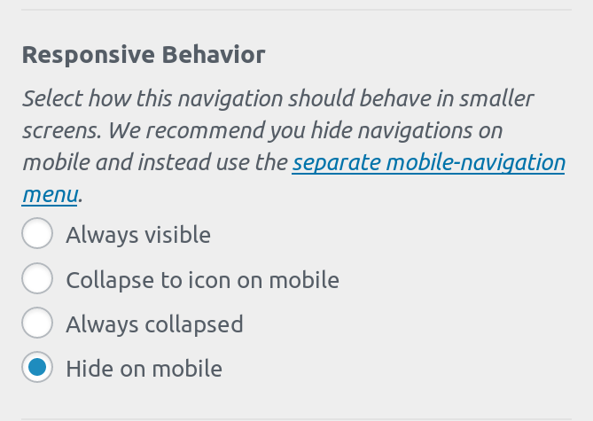
Using the “Responsive Behavior” control you can select how your menus will behave on smaller devices and viewports.
The available options are:
- Always visible
- Collapse to icon on mobile
- Always collapsed
- Hide on mobile
As a rule of thumb, avoid showing any navigation menus on mobile devices. The Gridd theme includes a separate navigation for mobile devices which is specifically designed for smaller viewports, is easier to navigate with a thumb and is a much better UX pattern than a traditional collapsed menu.
Always visible
Selecting “Always visible” will make this navigation menu remain unchanged regardless of the viewport. Only use this for very small menus (no more than 3 items), small text, or when the navigation is in vertical mode.
Collapse to icon on mobile
Select this option if you want your menu to collapse to an icon in viewports smaller than the breakpoint defined in your grid options.
Always collapsed
By selecting this option, you menu will always be minimized requiring the user to click on an icon in order to expand it and access its items.
Hide on mobile
This is the recommended and default option for all navigation. When selected, the navigation will be hidden for smaller devices so you can use the separate mobile navigation in the Gridd theme for small viewports. See this article for more details on the mobile menu.
Padding
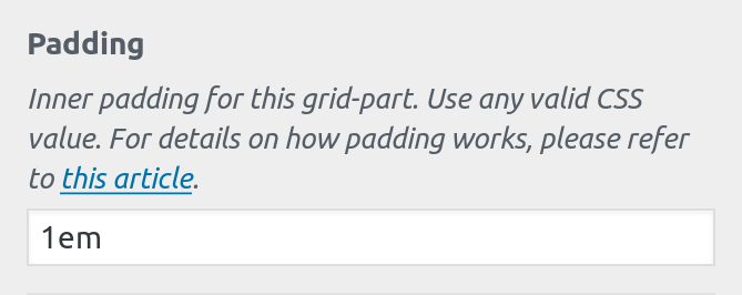
In the “Padding” setting you can define the inner padding for the grid-part.
This does not affect the padding between items, it refers to the padding around the navigation.
Background Color
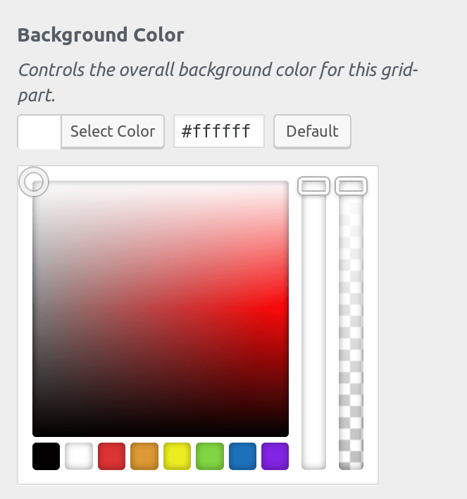
In the “Background Color” setting you can choose the background for the entire grid-part. This includes the navigation, the padding you have applied, as well as any available space depending on your grid layout.
The background color also controls the menus text color. Depending on your background, an appropriate color is automatically applied to the menu items to ensure maximum readability and compliance with WCAG regulations.
Accent Background Color
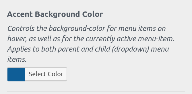
Using the “Accent Background Color” setting you can select the background color of the active menu, as well as the color of navigation items on hover.
Similarly to the background-color control, the text color is automatically calculated to ensure maximum readability.
Enable Vertical Mode
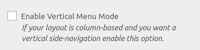
Depending on your layout and where the navigation is positioned on your grid, you may want a vertical navigation. Enabling this option transforms the menu from horizontal to vertical.
Justify Items
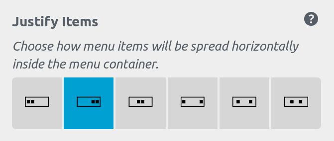
Navigations use the CSS Flexbox model, and this control allows you to affect the justify-content property. You can choose one of the following:
- Start (flex-end)
- End (flex-start)
- Center (center)
- Space Between (space-between)
- Space Around (space-around)
- Space Evenly (space-evenly)
For more details on how justify-content works please refer to this article on MDN.
Expand Icon & Position
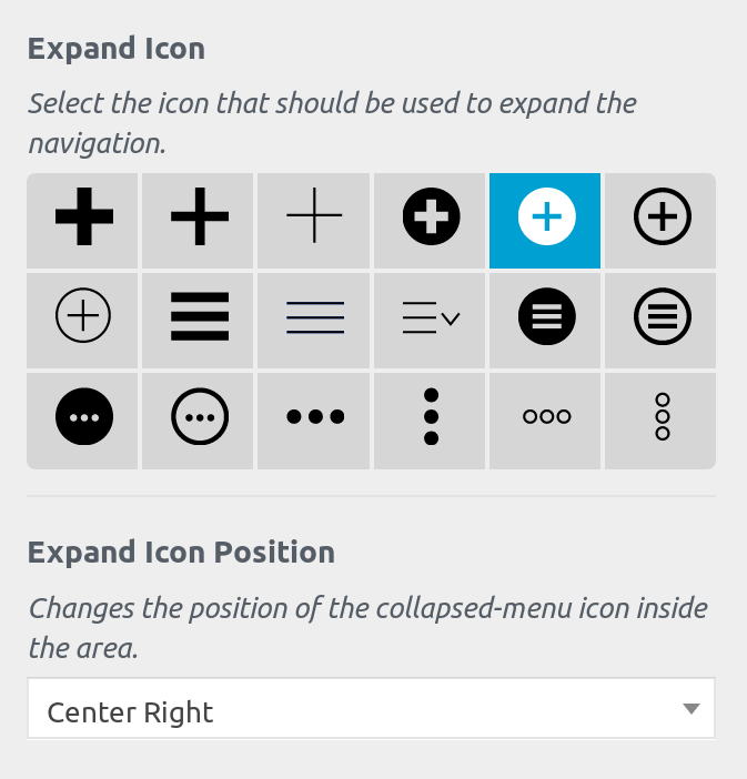
If you have selected to collapse your menus to an icon on mobile devices or to always show a collapsed menu, then 2 more options become available:
- Expand Icon
- Expand Icon Position
In the “Expand Icon” setting you can select the icon tht will be shown when the menu is collapsed. Depending on your selection in this setting, an approprite icon and animation will automatically be applied to be shown when the menu is open so that users can collapse it.
In the “Expand Icon Position” setting you can select where the icon will be placed inside the space assigned to the navigation area on your grid.